In response to Tony’s request, this post describes how I process my photos before I publish them on the web. I learned this process from Paul, my instructor at BCIT. He’s the professional; I’m an amateur. The steps have since been modified to fit my use for the web. They have worked well for me.
Gear
- Canon EOS T2i Digital SLR (the latest version is a T7i)
- 1 x standard kit lens (used frequently); portrait lens (used on occasion)
- 1 x UV filter as lens protection
- 4 x battery packs
- 2 x Class 10, 32GB memory card
- 1 x Class 10, 16GB memory card
Settings
When I first started, I took photos in RAW format. Now, I take photos in JPEG format because it saves disk space and I don’t use them for more than publishing my personal photobooks or posting them on the web.
Photo Editing with PhotoShop
Are there times when a photo does not turn out because it was too bright/dark that day, the colours are off, or there’s a random stranger in the photo? This is where post-processing comes into play, aka photo editing.
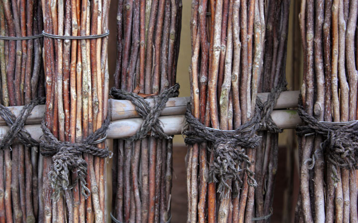
Original photo
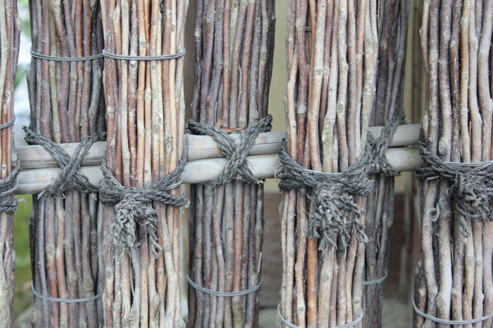
The photo doesn’t look too bad, but how can I make it better?
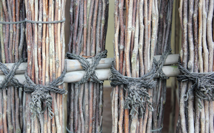
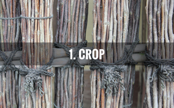
#1 Crop
I ask myself: What am I trying to focus on?
I like the details of the ropes that hold the twigs together, so I crop my photo to zoom in a bit and remove some of the left side. If your photo is not high res, refrain from zooming in too much. Otherwise, it becomes pixelated.

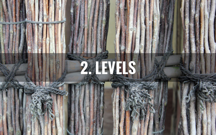
#2 Levels
Adjust the levels so that your blacks are really black and your whites are really white. This gives your photo contrast.
In PhotoShop, use Cmd+L (or Ctrl+L on Windows) to bring up the Levels graph. The graph looks like a mountain. Slide the left arrow to the where the foot of the mountain starts and likewise for the right arrow. See demo image.
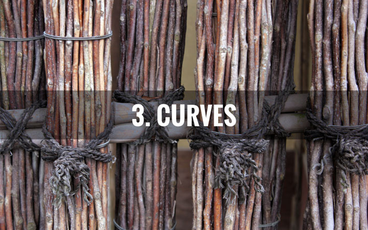
#3 Curves
Next, I work on the Curves. Indoor lighting or ambient lighting sometimes skew the colours of the photo. With curves (Cmd+C or Ctrl+C) you can sample the image to pick up true blacks, greys and whites and reset the colours. For example, if I use the colour picker to sample a twig that is a greenish-grey as mid-tone grey, it corrects the image by lifting the red colours.
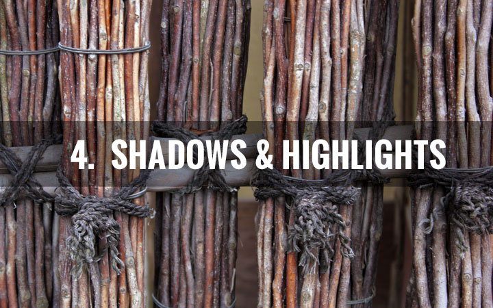
#4 Shadows & Highlights
Remember the time you wanted to take a photo with lots of sky and grass? You point to the sky; the grass becomes extremely dark. Then you point to the grass; the sky is so bright you can’t see the outline of the clouds. This is most apparent when you use your smartphones. Why?
It’s because your camera samples the overall brightness of the photo and adjusts the amount of light it lets in. So if you’re pointing at the sky, it thinks “too bright” and goes into sunglasses mode, making the rest of the photo too dark. Vice versa.
Don’t worry, this can be corrected (to an extent).
In PhotoShop, you can adjust the Shadows and Highlights (Image > Adjustments > Shadows & Highlights) to make the image more balanced. Instagram has this setting too! In fact, Instagram has Lux, a feature that enhances underexposed images.
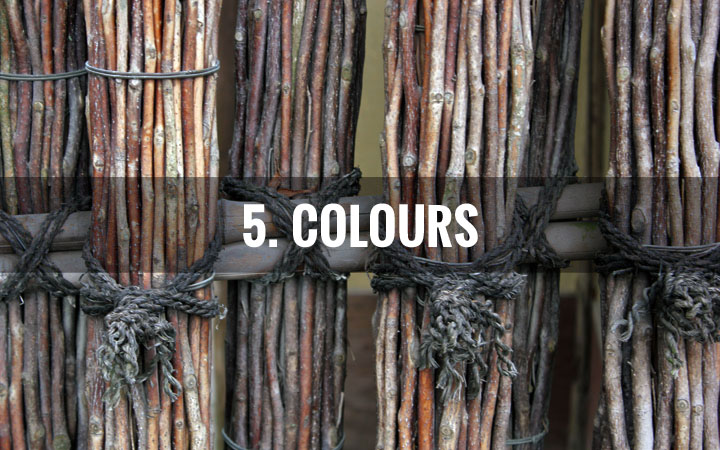
#5 Colours
Can we make reds more red? Blues more blue? Yellows more yellows?
Yes! There are many ways and they can all be found under Image > Adjustments:
- Colour Balance (Cmd+B or Ctrl+B)
- Selective Colour
- Vibrance
- Hue / Saturation (use in moderation otherwise it looks fake)
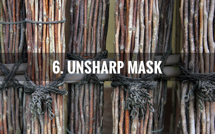
#6 Unsharp Mask
This last step I never skip because it distinguishes between mediocre and wow: Unsharp mask. Found under Filters > Sharpen in PhotoShop, this filter gives unsharp areas of your photo the sharpness and clarity that it deserves.
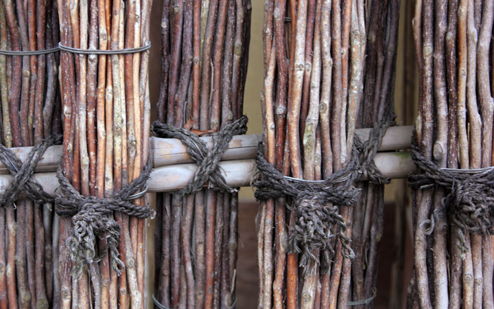
That’s it! Many of these settings are found on Instagram too. Give it a try and let me know how it goes.
See it in succession:
Ta-da!
Nice tips! I’ll keep that in mind as I post my next IG.
Thanks!
Thanks for answering my question, Tiff. Great post and I like how some of these tips can be used in IG too.